Close your eyes for a few moments and if you are not already, imagine you are out in the open:
What color is the sky?
Is it soft blue or intense and brilliant? Maybe it’s so clear that it looks almost gray, just like on a dull day… Or are you seeing a deep blue sky during a quiet starry night?
It doesn’t matter what shade you have in mind, because the blue of the sky in its various shades, from the early hours of the day until late at night, seems to be the color for excellence in Spring/Summer 2021 at Première Vision Paris.
Blue, more precisely the “Classic Blue” was elected by Pantone as the Colour of the Year 2020. Many were waiting for it, even better if declined in its changing shades, during a sunny spring morning or a hot summer sunset.
In the Blue painting by Blu…shades of blue at Première Vision Paris
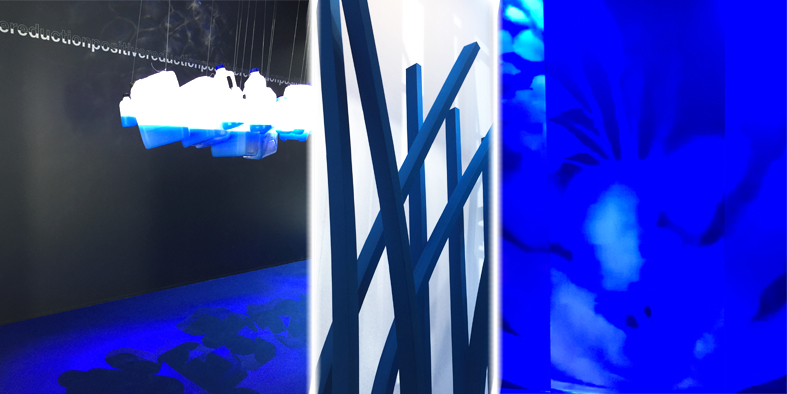
And it was precisely under a variable sky, on a day in February, that my journey within the trend area of Première Vision Paris began. Leaving a shy sunshine outside, the blues in the trend area took strength and vigor as the hours went by, at least until the sky got darker with the arrival of some clouds. It is always fascinating to observe the colours through the light filtered through the skylights of the fairground, even if it can become complex to capture the true mood:
Is it a saturated blue? No, maybe it’s lighter… it’s definitely cold, oops! No, no, it’s definitely warm!
After a first analysis of the colors presented for Spring/Summer 2021, I followed randomly some color paths dyed totally blue. Places of passage, experimentation and interaction, probably created with the intention of intriguing the visitor by offering a clear reading of the new trends. Everything had a more complete and deep sense to my initial perception: the blue of the sky blends with everything around us, the air, the land, the sea…

Trends between optimism and enthusiasm
Première Vision Paris’ Spring/Summer 2021 colors are not static but changeable, flexible, light and material, positive.
“The spring season strongly supports the shift towards greater eco-responsability, powerfully infusing profound optimistic change throughout the fashion industry. A season with an excitingly energetic approach to new ways of doing things, to changing nature of texture and substance, color and fantasy. It undermines the predictable, making way for the beauty in chance and tangible irregularities. It overturns the rules of gravity, extracting novel densities even out of lightness and evanescence.”
(source: Première Vision Paris)
#FLEXBILITY #POSITIVE REDUCTION #IN MOTION #MATERIALISING
THE COLORS OF PREMIÈRE VISION PARIS SPRING/SUMMER 2021
The chromatic proposal of Première Vision Paris S/S 2021 has 23 colors as its protagonists, among these stand out in particular: Sky on Earth, Blue Leap, Bleached Lemon, Menthol Foam, Raspberry Botox, Fizzy Melon, Honey Beam.
“…A color range embracing a reversed order, inviting freedom alliances. As if in freeze-frame, the range opens new horizons onto shifting encounters between light and depth, substance and delicacy. Colours create fleeting connections in tone-on-tones, in majestic monochromes or in clashing warm/colds and contrasts, with an emphasis on bluish hues.”
(source: Première Vision Paris)
Looking at the Première Vision Paris color chart, it is possible to distinguish mainly bright and medium saturated shades. On the other hand, the presence of light colors and very dark nuances is small.

Spring/Summer 2021 will reserve us a jubilation of:
⇒ Brightly colored prints on recycled materials
If you love bright colors and are very sensitive to the theme of sustainability, you will not be disappointed by the chromatic effects of these fabrics. There are no faded tones, on the contrary, you will be surprised by these fabrics with intense and vigorous nuances. Eco-friendly yes, but with liveliness!
⇒ Prints with exotic references
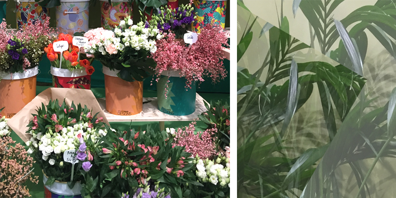
If you are returning from travel and adventurous experiences, or simply love the Jungle theme, you cannot do without a careful selection on the theme: animals, leaves, plants, flowers of all kinds … an overlap of shades of greens, combined with exotic and exuberant colors. And for those who prefer a little more rigor, there will be prints of ancient maps on a light background.

⇒ Geometric patterns
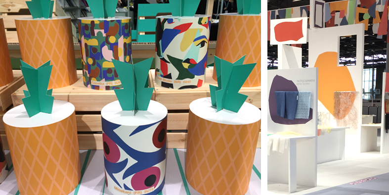
Whether they are circles, squares or abstract designs, it does not matter: the mix & match of lines, figures and colors creates captivating chromatic harmonies, from the warmest and most whimsical ones to the freshest and most delicate ones. Password: overlap with care!
⇒ Flowers forever…
If there’s no trace of any floral-themed clothing in your wardrobe, don’t worry, you can still make up for it! Prints, decorations, appliqués, embroideries of flowers, leaves and more or less precious vegetables will accompany us also next year…

Must Have Colors S/S 2021
MAN WEAR
Colors: Peppery Purple, Sky on Earth, Blue Hole, Blue Leap, Caviar Stare, Limestone, Blue Struggle.

CASUAL WEAR
Colors: Blue Leap, Peppery Purple, Honey Beam, Blue Struggle, Sand Balm, Feral Earth, Caviar Stare, Post Coral.

WOMAN WEAR
Colors: Post Coral, Peppery Purple, Buttery Moss, Menthol Foam, Plastic Violet, Feral Earth, Fresh Breeze, Raspberry botox.

The colors shown in the images are Pantone TPG colors identified by thecolorforme.com and are inspired by the Première Vision Paris S/S 2021 color chart.
